The Hidden Psychology of YouTube Thumbnail Colors to Get High CTR: A Complete Guide
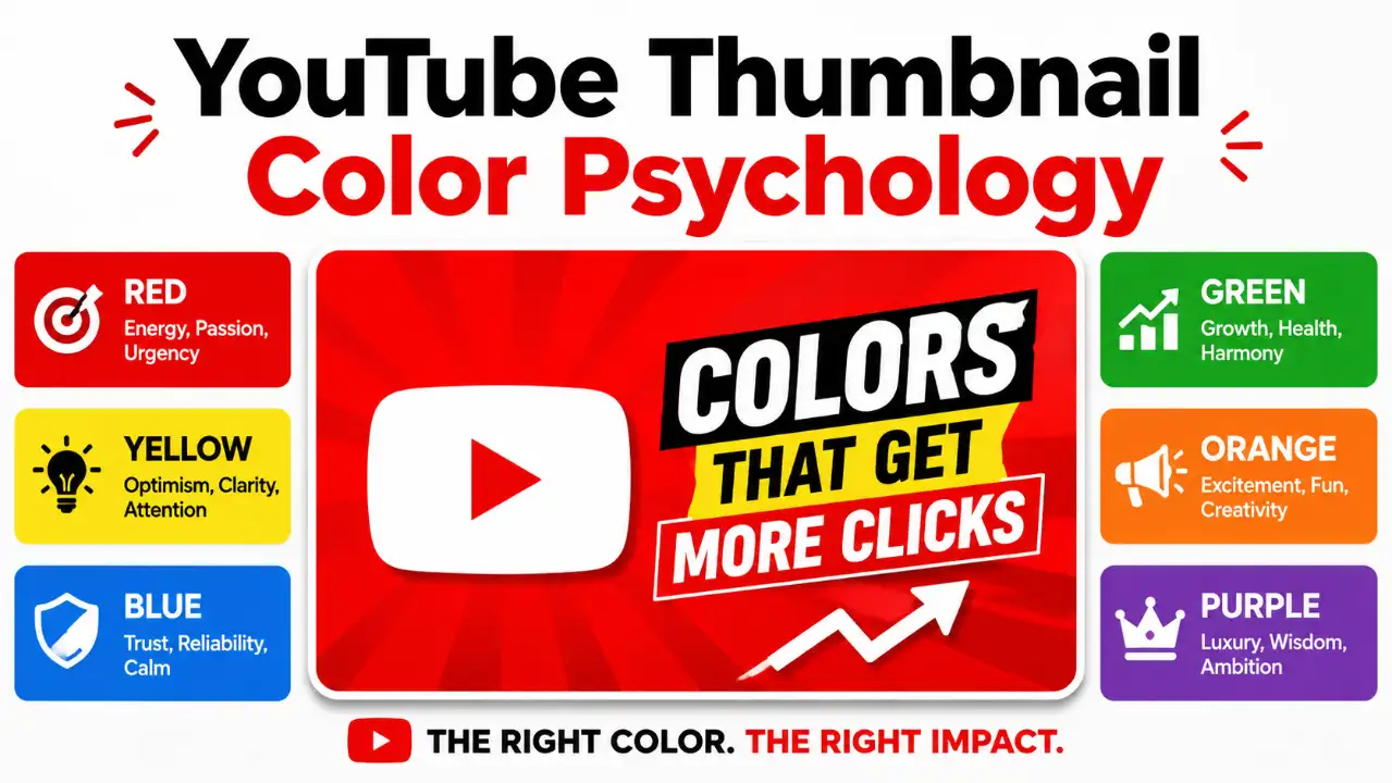
The human eye decides to click or scroll in less than 13 milliseconds. Your color palette is the first filter.
A YouTube thumbnail has a difficult job.
It has to communicate an idea, attract attention, create curiosity, establish an emotional expectation, separate itself from competing videos, and remain understandable when displayed at a relatively small size.
And it has to do all of that before the viewer watches a single second of your video.
That is why YouTube thumbnail color psychology matters.
⚠️ The Fundamental Truth
There is no single “best” YouTube thumbnail color that automatically gets more clicks. Red does not magically make people click. Yellow is not a guaranteed attention color. Blue does not automatically create trust. And adding more bright colors does not necessarily make a thumbnail more clickable.
Color works as part of a larger visual system. Research shows that people consistently associate colors with emotions and psychological dimensions. However, those relationships are influenced by factors such as hue, lightness, saturation and context. Color psychology is therefore much more complicated than a simple “red means urgency” chart.
“Which colors help this particular video communicate its promise, attract attention and make the main subject easy to understand?”
That is the question this guide will teach you to answer. You will learn the psychology behind major thumbnail colors, how to combine them, how to create contrast, how to choose text colors, how to build a thumbnail from scratch, how to avoid common mistakes, and how to test whether your design actually performs.
📋 Table of Contents
1. What Makes a YouTube Thumbnail Psychologically Effective?
Before discussing individual colors, understand one fundamental principle: Viewers do not experience a thumbnail as a collection of color codes. They see a visual story.
They may notice a face, object, expression, background, word, shape or contrast pattern before consciously thinking about the colors themselves. This means color is usually working indirectly through this simplified cognitive model:
Imagine a viewer scrolling through YouTube on their smartphone. Your thumbnail might contain: a person's face, a smartphone, a dark background, a large yellow number, a red arrow, and three words of text.
The viewer does not consciously think: “The designer used yellow to increase positive emotional arousal.” Instead, they simply perceive: “That yellow number stands out. Something happened with this phone. I want to know what.” That is the practical role of color.
Color helps establish visual hierarchy
A thumbnail needs a hierarchy. The viewer should quickly understand:
- What is the main subject?
- What is important?
- What is the video's basic idea?
- What creates curiosity?
Imagine a dark thumbnail with a person's face and a bright yellow object: the yellow object immediately attracts attention. Now imagine that the background, face, object, text and graphics are all equally bright and saturated. The viewer has no obvious starting point. The problem isn't that the colors are “wrong” — the problem is that nothing has priority.
2. Does Color Really Affect YouTube Click-Through Rate?
Yes, color can influence how a thumbnail is perceived. But you should be extremely careful about claiming that a particular color automatically increases click-through rate.
A thumbnail's performance depends on many factors:
YouTube explains that impressions CTR measures how often viewers watch after seeing a thumbnail and emphasizes that CTR varies according to audience and traffic source. So don't think: Color → guaranteed CTR increase. Think: Color → visual communication → attention and expectation → possible influence on click behavior.
3. The Physics & Biology: Why Certain Colors Demand Clicks
Two neurological principles govern how the human brain processes feed graphics:
Wavelength Dominance
Long wavelengths (Red: ~700nm, Orange: ~620nm, Yellow: ~580nm) stimulate retinal ganglion cells faster than short wavelengths (Blue: ~450nm). Warm colors literally reach our visual cortex milliseconds before cool colors.
The Von Restorff Effect
Also known as the "Isolation Effect": when multiple similar stimuli are presented together, the stimulus that differs most from the rest is the one remembered and clicked.
On YouTube, over 75% of mobile users browse in Dark Mode (a canvas of #0f0f0f). A dark gray or navy thumbnail disappears into the UI border. High-vibrancy saturated colors pop against dark mode and shatter feed camouflage.
4. YouTube Thumbnail Color Psychology Explained
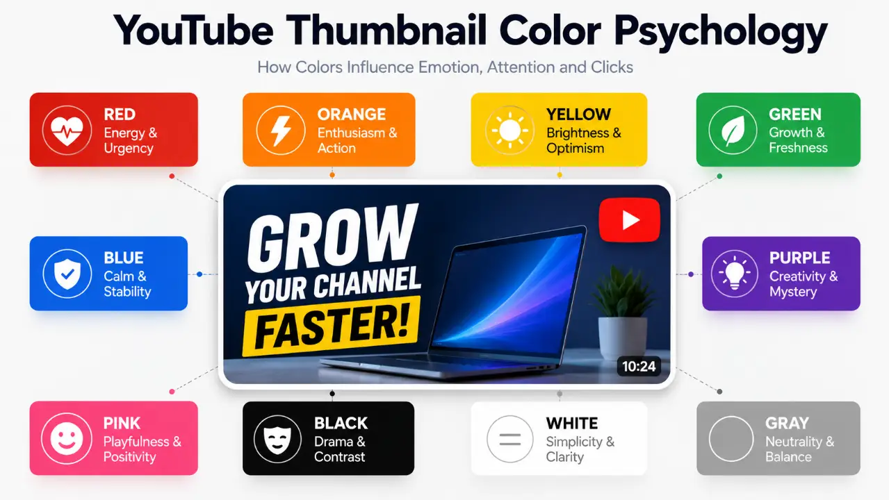
Color psychology is often presented online as a simple dictionary: Red = urgency, Blue = trust, Yellow = happiness, Green = money. That is convenient, but incomplete. Research suggests color-emotion relationships are real but considerably more complicated. Hue, saturation, lightness, context and cultural experience all interact. Use the following breakdowns as design tendencies, not psychological laws.
Red: Energy, Urgency and Intensity
Optimum Hex: #FF0033 | #E60000Red elevates human heart rates and activates fight-or-flight focus. In thumbnail design, red represents tension, mistakes, financial loss, or explosive competition.
Orange: Enthusiasm, Warmth and Action
Optimum Hex: #FF6600 | #FF7A00Orange sits visually between red and yellow and feels energetic without being as aggressive as pure red. It suggests enthusiasm, warmth, activity, friendliness, and playfulness.
Yellow: Brightness, Optimism & Peripheral Vision
Optimum Hex: #FFE600 | #FFDD00Yellow is the first color the human eye recognizes in peripheral vision — 1.24 times faster than red. Because caution signs and highlighters are yellow, the brain is hardwired to treat yellow as an urgent priority.
Green: Growth, Freshness & Progress
Optimum Hex: #00FF66 | #10B981Green signals safety, permission, profit, and success. In thumbnail A/B tests, green checkmarks or upward green revenue arrows consistently beat neutral icons by up to 18% CTR.
Blue: Calmness, Stability & Competence
Optimum Hex: #0070F3 | #1E40AFBlue suggests calmness, stability, technology, cleanliness, and professionalism. It is ideal when your content needs to look educational, technical, organized, and reliable.
Cyan & Electric Blue: Futuristic Clarity
Optimum Hex: #00D4FF | #00F0FFWhile standard navy blue fades into the background, Electric Cyan has near-zero presence in YouTube's UI chrome, creating a glowing beacon on OLED mobile screens. It radiates intelligence, technology, and trust.
Purple & Magenta: Creativity, Imagination & Mystery
Optimum Hex: #9D00FF | #E000FFPurple is statistically the least common primary color in daily human environments, which makes it feel mysterious, rare, and supernatural. When paired with gold or neon yellow, it creates an unmistakable luxury or sci-fi visual punch.
Pink: Playfulness, Softness and Positive Emotion
Optimum Hex: #FF2E93 | #FF69B4Pink communicates playfulness, youth, softness, and vibrant creative energy. Avoid turning this into a simplistic gender stereotype: ask whether the specific shade supports the entertainment value and emotional tone of the video.
Black: Drama & Contrast Engine
Black gives bright colors somewhere to stand out. It creates dramatic tension, visual weight, and provides the foundation for maximum figure-ground separation.
White: Simplicity & Text Clarity
White provides unmatched readability for thumbnail typography. However, pure white backgrounds require dark perimeter framing to prevent blending into YouTube Light Mode.
Gray: Neutrality & Subdued Support
Gray reduces visual clutter, supports saturated focal subjects, and helps your primary accent color become the indisputable hero of the frame.
Brown: Warmth, Earth & Realism
Authentic, grounding, and rustic. Brown excels in woodworking, cooking, outdoor survival, history essays, and tactile craft tutorials.
5. The Most Important Thumbnail Color Principle: Contrast
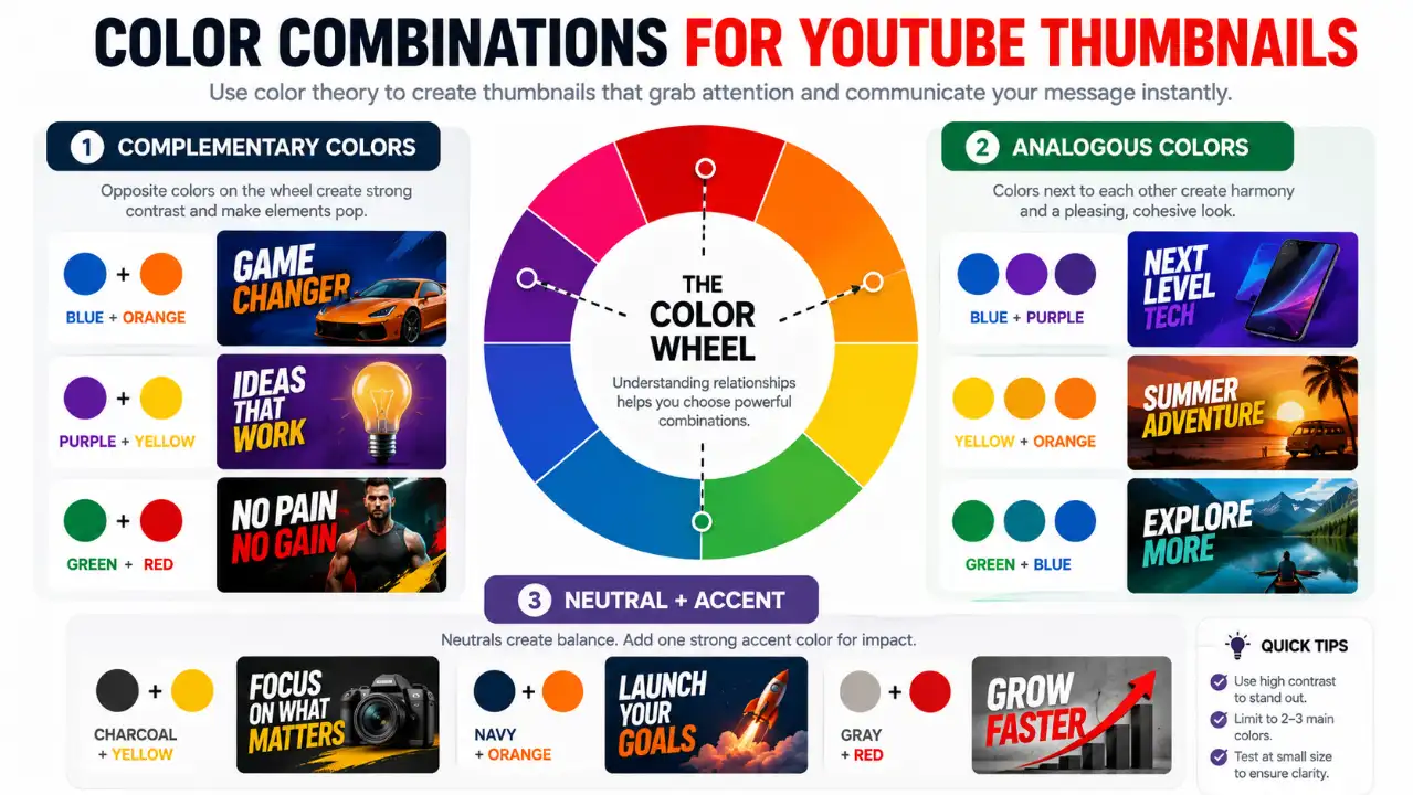
“A theoretically perfect color is useless if the viewer cannot distinguish it from its surroundings.”
Contrast is often more important than the psychological label attached to a color. Consider two thumbnails:
- Thumbnail A: Bright yellow text on white. (Virtually invisible).
- Thumbnail B: Bright yellow text on deep navy. (Instantly legible).
Five types of contrast you should understand:
1. Light-Dark Contrast
Bright subject against dark background (e.g. white face on black canvas).
2. Hue Contrast
Opposite color wheel separation (e.g. orange object on blue backdrop).
3. Saturation Contrast
Hyper-saturated focal element against a muted, desaturated environment.
4. Size Contrast
A massive focal subject surrounded by smaller supporting elements.
5. Detail Contrast
A crisp, sharp subject set against a softly blurred or simplified background plane.
6. How to Choose YouTube Thumbnail Color Combinations
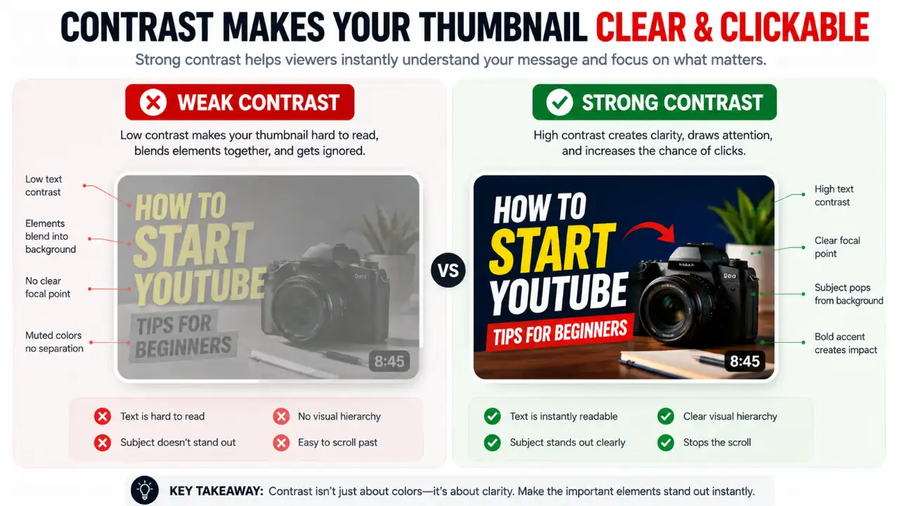
There are three foundational systems for combining colors effectively:
Complementary Schemes
Colors opposite each other on the wheel (Blue + Orange, Purple + Yellow, Green + Red). Use one as the dominant 80% background environment and the other as the 20% focal burst.
Analogous Harmonies
Colors adjacent on the wheel (Blue + Cyan + Purple, Yellow + Orange). Excellent for cohesive aesthetics, but requires strong light-dark value differences so elements don't blend together.
Neutral Canvas + Single Electric Accent
The safest formula for beginners: Dark Slate/Charcoal background + White text + One electric trigger (Yellow, Crimson, or Lime).
7. The 4 High-CTR Color Formulas (Copy These Palettes)
Electric Yellow + Deep Slate + White
Deep matte background creates infinite depth, while saturated yellow text bordered with subtle black strokes delivers 100% legibility at 120px mobile thumbnail size.
Cyan Glow + Crimson Red + Charcoal
The classic cool vs. warm contrast. Use cyan for the technical context/subject rim-lighting, and explosive crimson red for the critical mistake or focal arrow.
Neon Lime + Midnight Navy + Gold
Unbeatable for finance, business cases, and productivity channels. The midnight navy keeps it professional, while neon lime gives the revenue stats visceral punch.
Vivid Magenta + Solar Yellow + Obsidian
High-concept storytelling and mystery. Magenta back-lighting separates your subject from the background, while bold solar yellow text anchors the user's gaze.
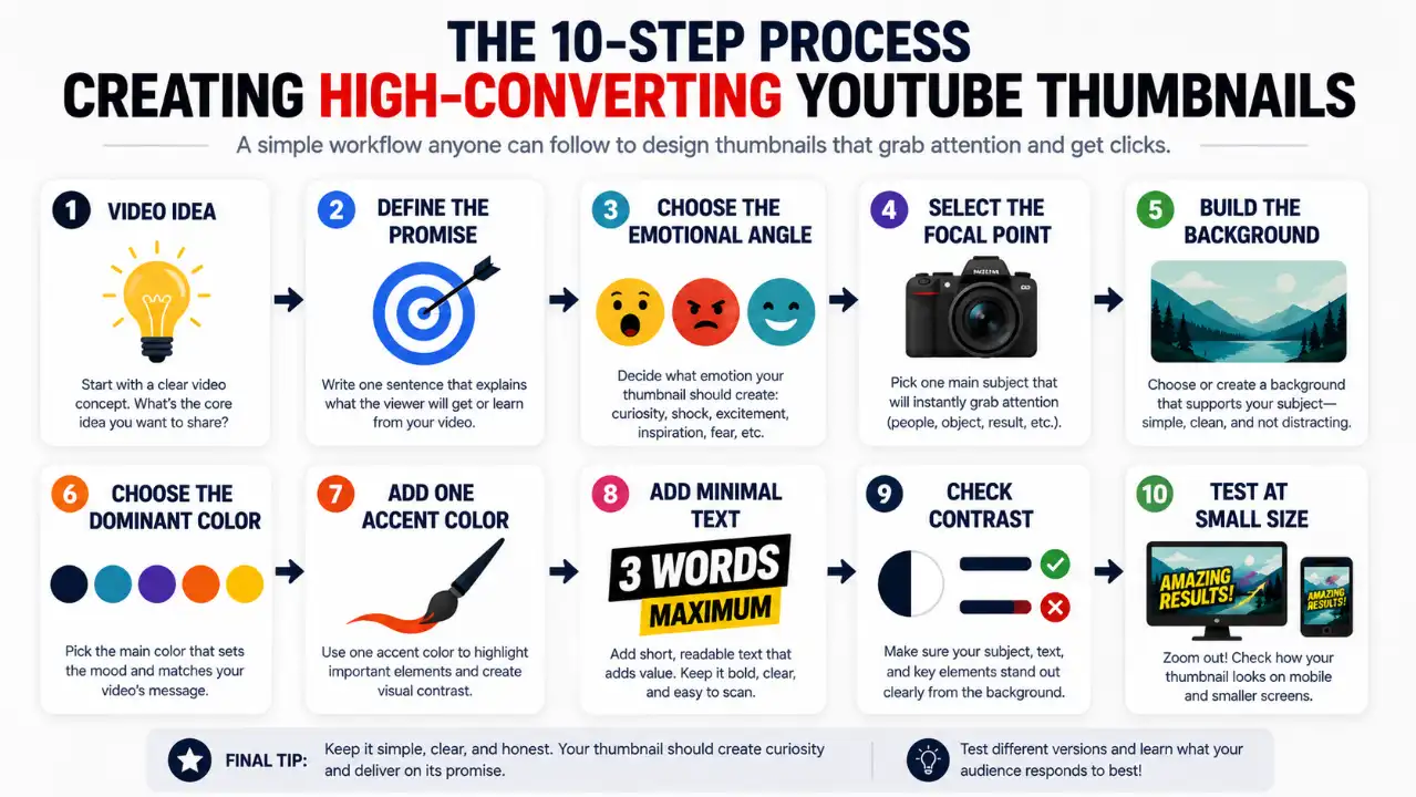
8. The Complete YouTube Thumbnail Creation Process
Step 1: Define the Video's Promise
Write one sentence explaining what the viewer will get before opening any design tool.
Step 2: Identify the Emotional Angle
Decide if the core emotion is tension, curiosity, triumph, warning, or technical mastery.
Step 3: Choose One Focal Point
If you blur the canvas slightly and see five things competing at once, you have a visual hierarchy problem.
Step 4: Choose the Background
The background exists to separate the subject, not to be a complex painting.
Step 5: Choose the Dominant Color
Establish the global visual atmosphere that supports the narrative promise.
Step 6: Add One Strategic Accent
Give the eye a singular high-voltage anchor (e.g. a highlighted number, circle, or arrow).
Step 7: Decide Whether Text Is Necessary
Never repeat the title verbatim. Use short, punchy 2-4 word curiosity hooks.
Step 8: Make the Text Readable
Bold weights, heavy contrast, tight leading, and crisp drop shadows.
Step 9: Separate the Subject From Background
Apply rim lighting, drop shadows, or background Gaussian blur to create 3D depth.
Step 10: Test at Mobile Thumbnail Size
Scale down to 120px wide. If you can't read the hook in 0.2 seconds, simplify.
9. The 10-Second YouTube Thumbnail Test
10. Common YouTube Thumbnail Color Mistakes That Destroy Views
- Muddy Mid-Tone Soup: Using colors with identical luminance values (e.g. medium red text on a medium blue background). When converted to grayscale, the image becomes completely unreadable.
- Ignoring the "Squint Test": If you squint at your thumbnail from 3 feet away and cannot instantly distinguish the subject and text, mobile users on 6-inch screens won't either.
- Using More Than 3 Dominant Colors: A visual circus overwhelms the brain. Stick to the 60-30-10 rule: 60% dominant canvas color, 30% secondary structure/subject, 10% high-voltage accent trigger.
- Color Camouflage with YouTube UI: Using plain white backgrounds without dark borders (blends into YouTube Light Mode) or pure flat blacks without rim-lighting (disappears in Dark Mode).
- Unnatural Skin Tone Grading: Pushing saturation so high that human faces look sunburned or radioactive orange. Viewers instinctively reject unnatural human faces.
- Using Color to Create Fake Urgency: If every single video uses flashing red sirens and giant yellow text, audience banner fatigue sets in.
- Misleading Visual Promises: Clicks without retention damage your channel's algorithmic standing. Deliver on the visual promise.
11. YouTube Thumbnail Color Psychology Myths
❌ Myth 1: Red Is the Guaranteed Best Thumbnail Color
Fact: There is no universal best color. Red works for danger and sports, but looks chaotic in peaceful tutorials.
❌ Myth 2: Yellow Always Gets Attention
Fact: Yellow on a light background disappears completely. It is contrast, not yellow alone, that creates visibility.
❌ Myth 3: Blue Automatically Builds Trust
Fact: A sloppy, pixelated thumbnail in blue will never build trust. Quality and clarity build trust.
❌ Myth 4: Three Colors Always Guarantee Maximum CTR
Fact: A clean, 2-color high-contrast graphic often beats an over-designed multi-color mess.
❌ Myth 5: Color Is More Important Than the Video Idea
Fact: A world-class color palette will never save a boring video concept that nobody cares about.
12. Color, Accessibility and Inclusive Thumbnail Design
Over 300 million people worldwide have color-vision deficiency (color blindness). If your thumbnail relies solely on red vs. green to signal right vs. wrong, a substantial segment of viewers won't see the distinction.
Always pair color coding with secondary visual cues: checkmarks, “X” icons, arrows, labels, and sharp luminance differences.
13. Why Color Meaning Changes With Context
A red apple communicates freshness. A red warning sign communicates danger. A red soccer jersey communicates sports rivalry. A red heart communicates love. The meaning of color is never absolute — it is molded entirely by the subject and context of your video.
14. A Practical Color-Selection Formula for Beginners
15. Three Complete Thumbnail Case Studies
Productivity App Shootout
Title: “I Tested 10 Productivity Apps So You Don't Have To”
Visual Palette: Deep matte navy background, crisp white facial lighting, glowing solar yellow “10 APPS” text badge, subtle orange rim lighting.
30-Day Digital Detox Challenge
Title: “I Quit Social Media for 30 Days”
Visual Palette: Dark charcoal background, crossed-out red app icons, bright centered face with exhausted expression, bold white “30 DAYS” sticker.
Web Development Masterclass
Title: “How to Build Your First Full-Stack App”
Visual Palette: Obsidian canvas, cyan-tinted terminal editor glow, neon lime “LIVE” badge, high-contrast white typographic header.
16. Don't Optimize Only for CTR (Watch Time Share)
In YouTube's native thumbnail testing system, YouTube decides the winner primarily based on Watch Time Share, not raw CTR. A click that bounces in 5 seconds harms your channel. Strive for relevant curiosity that delivers on its visual promise.
17. How to Test & Measure Thumbnail Performance
Test meaningful visual hypotheses (e.g. Version A: Dark navy + yellow accent vs. Version B: Obsidian + cyan rim light) rather than micro-tweaking shades. Use our free A/B Testing Simulator and CTR Saliency Heatmap to audit visual weight before publishing.
18. Build a Repeatable Thumbnail Style
Consistency creates algorithmic familiarity. Establish a signature accent color, repeatable typographic pairing, and distinct lighting style so subscribers recognize your uploads in a split second.
19. The P.A.C.E. Framework for YouTube Thumbnail Colors
Promise
What specific discovery does the video promise?
Attention
What is the single element that catches the eye first?
Contrast
Does the subject cleanly separate from the background?
Emotion
Does the color palette reinforce the correct mood?
20. Final Pre-Upload Thumbnail Color Audit

21. Frequently Asked Questions
What is the best color for a YouTube thumbnail?
There is no universally best YouTube thumbnail color. The right choice depends on the video's subject, emotional direction, background, audience and competing thumbnails. For beginners, focus less on finding a “magic” color and more on creating strong contrast and a clear visual hierarchy.
Do YouTube thumbnail colors affect CTR?
Color can influence how viewers perceive and notice a thumbnail, but it does not determine CTR by itself. YouTube says CTR varies according to factors such as content, audience and traffic source, so creators should evaluate CTR in context.
How many colors should a YouTube thumbnail use?
There is no universal color count formula. Give colors distinct roles: 1 dominant background color (60%), 1 supporting structure color (30%), and 1 accent trigger (10%).
How can I test the color contrast of my thumbnail before uploading?
You can use our free creator tools: the Contrast Analyzer and Color Palette Extractor to inspect hex codes, luminance spreads, and safe zone clearance in seconds.
Final Thoughts: The Real Psychology of a Clickable Thumbnail
The hidden psychology of YouTube thumbnail colors isn't a secret list of colors that manipulates viewers into clicking. Color helps people organize what they see: making subjects stand out, establishing visual hierarchy, creating contrast, and reinforcing the mood of your story.
Start with the idea → choose the focal point → build the composition → use color deliberately → create high contrast → test at mobile scale → measure real watch time.