Does YouTube Thumbnail Color Really Affect Click-Through Rate?
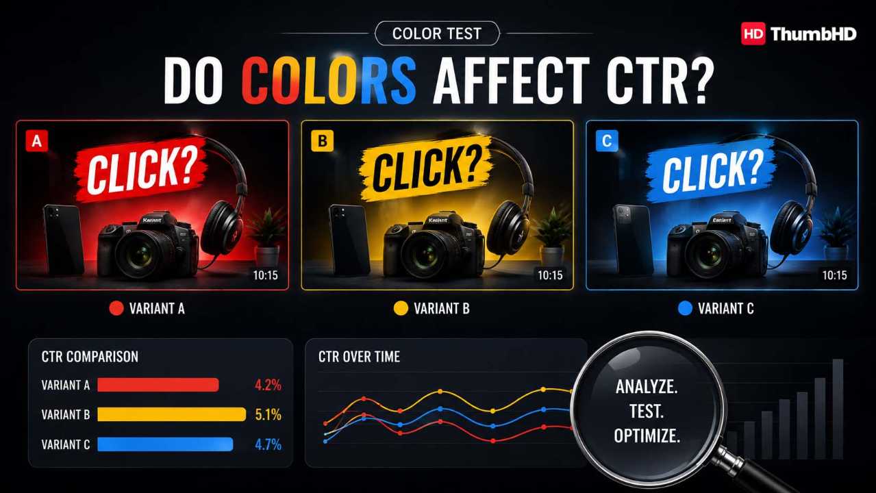
The Science of Thumbnail Color Impact
📌 Table of Contents
A YouTube thumbnail has a difficult job.
It has to communicate an idea, attract attention, create curiosity, establish an emotional expectation, separate itself from competing videos, and remain understandable when displayed at a relatively small size.
And it has to do all of that before the viewer watches a single second of your video.
That is why YouTube thumbnail color psychology matters.
But there is an important misconception to clear up first:
There is no single “best” YouTube thumbnail color that automatically gets more clicks.
Red does not magically make people click. Yellow is not a guaranteed attention color. Blue does not automatically create trust. And adding more bright colors does not necessarily make a thumbnail more clickable.
Color works as part of a larger visual system.
Research shows that people consistently associate colors with emotions and psychological dimensions. However, those relationships are influenced by factors such as hue, lightness, saturation and context. Color psychology is therefore much more complicated than a simple “red means urgency” chart.
For YouTube creators, that leads to a much more useful question:
“Which colors help this particular video communicate its promise, attract attention and make the main subject easy to understand?”
That is the question this guide will teach you to answer.
You will learn the psychology behind major thumbnail colors, how to combine them, how to create contrast, how to choose text colors, how to build a thumbnail from scratch, how to avoid common mistakes, and how to test whether your design actually performs.
What Makes a YouTube Thumbnail Psychologically Effective?
Before discussing individual colors, understand one fundamental principle:
Viewers do not experience a thumbnail as a collection of color codes.
They see a visual.
They may notice a face, object, expression, background, word, shape or contrast pattern before consciously thinking about the colors themselves.
This means color is usually working indirectly.
A useful simplified model is:
Imagine a viewer scrolling through YouTube.
Your thumbnail might contain:
- a person's face
- a smartphone
- a dark background
- a large yellow number
- a red arrow
- three words of text
The viewer does not consciously think:
“The designer used yellow to increase positive emotional arousal.”
Instead, they might simply perceive:
“That yellow number stands out. Something happened with this phone. I want to know what.”
That is the practical role of color.
Color helps establish visual hierarchy
A thumbnail needs a hierarchy.
The viewer should quickly understand:
- What is the main subject?
- What is important?
- What is the video's basic idea?
- What creates curiosity?
Color can help direct that hierarchy.
For example, imagine a dark thumbnail with a person's face and a bright yellow object.
The yellow object may immediately attract attention.
Now imagine that the background, face, object, text and graphics are all equally bright and saturated.
The viewer has no obvious starting point.
The problem isn't that the colors are “wrong.”
The problem is that nothing has priority.
YouTube recommends keeping thumbnail designs from becoming overly complex. Its creator guidance notes that dynamic use of color and composition can help catch attention, while too much visual complexity can overwhelm the viewer.
Does Color Really Affect YouTube Click-Through Rate?
Yes, color can influence how a thumbnail is perceived.
But you should be extremely careful about claiming that a particular color automatically increases click-through rate.
A thumbnail's performance depends on many factors, including:
- the video idea
- the title
- the audience
- the traffic source
- the competing thumbnails
- the subject
- visual clarity
- curiosity
- timing
- channel familiarity
- the accuracy of the promise
YouTube explains that impressions CTR measures how often viewers watch after seeing a thumbnail and emphasizes that CTR varies according to factors such as audience and traffic source.
So don't think:
Think:
That distinction matters.
A beautiful red thumbnail with no compelling idea can fail.
A simple blue-and-white thumbnail with an excellent concept can succeed.
The idea and packaging come first. Color helps the packaging communicate.
To audit your packaging and evaluate your thumbnail's predicted performance before publishing, you can use our free YouTube Thumbnail CTR Analyzer to measure visual salience, focal point dominance, and click-through readiness.
YouTube Thumbnail Color Psychology Explained
Color psychology is often presented online as a simple dictionary:
- Red = urgency
- Blue = trust
- Yellow = happiness
- Green = money
- Purple = creativity
That is convenient, but incomplete.
Research suggests that color-emotion relationships are real but considerably more complicated. Color, saturation, lightness, context and cultural experience can all influence how colors are interpreted.
So use the following descriptions as design tendencies, not psychological laws.
Red: Energy, Urgency and Intensity
Red is one of the most powerful colors available to a thumbnail designer.
It can communicate:
- energy
- intensity
- danger
- urgency
- excitement
- action
- conflict
- importance
Research frequently associates red with high-arousal emotional responses, although those responses can include both positive and negative emotions.
That makes red particularly useful when the video's concept already contains intensity.
Good uses for red
Red can work well for:
- challenges
- surprising results
- dramatic experiments
- mistakes
- competition
- transformation
- warnings
- emotional stories
- extreme situations
Example
Video:
“I Tried Waking Up at 5 AM for 30 Days”
A thumbnail could show:
- a tired face
- a clock
- dark background
- “5 AM” in red
- a subtle red accent around the clock
The red isn't making the viewer click by itself.
It is reinforcing the video's sense of difficulty, urgency and intensity.

Red's biggest mistake
Using too much of it.
If the entire thumbnail is bright red, the viewer loses the benefit of red as an accent.
Instead of:
think:
Red becomes more meaningful when everything else gives it room to stand out.
Orange: Enthusiasm, Warmth and Action
Orange sits visually between red and yellow and often feels energetic without being as aggressive as strong red.
It can suggest:
- enthusiasm
- warmth
- activity
- friendliness
- optimism
- playfulness
Orange can be particularly useful for videos involving action.
Examples include:
- challenges
- experiments
- food
- travel
- lifestyle
- personal transformation
- entertainment
Example
Video:
“I Spent 7 Days Without My Phone”
The thumbnail could use:
- muted dark background
- large phone
- orange warning-style accent
- expressive face
- short text: “NO PHONE”
The orange helps create an energetic visual without requiring the entire thumbnail to become loud.

Yellow: Brightness, Optimism and Visual Energy
Yellow is naturally difficult to ignore when it contrasts strongly with its surroundings.
It can communicate:
- optimism
- energy
- playfulness
- brightness
- positivity
- caution, depending on context
But here's the practical lesson beginners often miss:
Yellow is only useful when it remains readable.
Yellow text on a white background can disappear.
Yellow against black or deep navy can become extremely prominent.
Strong combinations
Try conceptual combinations such as:
- yellow + black
- yellow + navy
- yellow + dark purple
- yellow + charcoal
Example
Video:
“I Tested 10 Productivity Hacks”
Thumbnail:
“10 HACKS?!”
Use yellow for the “10” against a dark background.
The viewer doesn't need to understand the psychology of yellow.
They simply need to notice the number quickly.

Green: Growth, Freshness and Progress
Green has a broad range of associations.
Depending on the shade and context, it can suggest:
- nature
- health
- growth
- freshness
- progress
- money
- sustainability
Green can work well for:
- fitness
- health
- money-related topics
- gardening
- sustainability
- productivity
- personal growth
- transformation
Example
Video:
“I Saved $10,000 in One Year”
A green accent can reinforce the financial/progress concept.
But don't turn the entire thumbnail into a green wall.
A dark or neutral background with a strong green focal element will usually create clearer hierarchy.

Blue: Calmness, Stability and Competence
Blue is one of the most versatile colors in thumbnail design.
It can suggest:
- calmness
- stability
- technology
- cleanliness
- professionalism
- reliability
- coolness
Blue can therefore be particularly useful when your video needs to feel:
- educational
- technical
- informative
- organized
- calm
- trustworthy-looking
But remember:
Blue does not automatically create trust.
The complete visual context matters.
Example
Video:
“How I Built My First Website”
A thumbnail might use:
- dark blue background
- laptop
- large face
- white text
- small electric-blue accent
The blue supports the technological subject while providing a strong background for lighter elements.

Purple: Creativity, Imagination and Mystery
Purple can be an excellent differentiator because it is less common in some thumbnail categories than basic red, yellow or blue.
It can suggest:
- creativity
- imagination
- mystery
- fantasy
- originality
- visual richness
Purple can work especially well for:
- creative projects
- unusual experiments
- mystery
- storytelling
- entertainment
- beauty
- imaginative subjects
Watch the saturation
Dark purple + black + dark blue can quickly become muddy.
If you use a dark purple background, give the focal subject enough brightness and contrast.
Pink: Playfulness, Softness and Positive Emotion
Pink can communicate different things depending on its shade and context.
It can suggest:
- playfulness
- softness
- creativity
- romance
- youthful energy
Avoid turning this into a simplistic “pink is for women” rule.
The correct question is:
Does this shade and visual context support the message of the video?
A vivid pink can work brilliantly in entertainment.
A muted pink can feel completely different.
Black: Drama, Mystery and Contrast
Black deserves special attention because its practical value in thumbnails is not only emotional.
Black is an incredibly useful contrast tool.
It can create:
- drama
- mystery
- seriousness
- sophistication
- visual weight
For thumbnail designers, one of the biggest benefits of black is simple:
It gives bright colors somewhere to stand out.
Imagine:
- black background
- bright yellow number
- white face
- red accent
The black isn't necessarily the “emotion.”
It is creating visual space for the important elements.
White: Simplicity, Cleanliness and Space
White can communicate:
- simplicity
- openness
- cleanliness
- minimalism
It is also extremely useful for text and highlights.
But white backgrounds have a problem:
They can reduce separation between light subjects and the background.
A white shirt on a white background may disappear.
White text over a pale background may become unreadable.
Therefore, white should be selected not just for what it represents, but for how it interacts with everything around it.
Gray: Neutrality and Supporting Contrast
Gray is rarely the star of the thumbnail.
And that is exactly why it can be useful.
Gray can:
- reduce visual noise
- create a neutral background
- support brighter colors
- create a more serious visual style
- help an accent color become dominant
Gray is often more useful as a supporting color than as the main emotional message.
Brown: Warmth, Earth and Tradition
Brown is less commonly used as a dominant YouTube thumbnail color, but that doesn't mean it is useless.
Depending on context, brown can suggest:
- earth
- warmth
- natural materials
- tradition
- rustic environments
It can work particularly well for:
- cooking
- woodworking
- outdoors
- history
- traditional crafts
- natural products
Brown becomes more interesting when it supports a real-world visual rather than being added merely because of supposed psychological meaning.
The Most Important Thumbnail Color Principle: Contrast
If you remember only one design principle from this article, remember this:
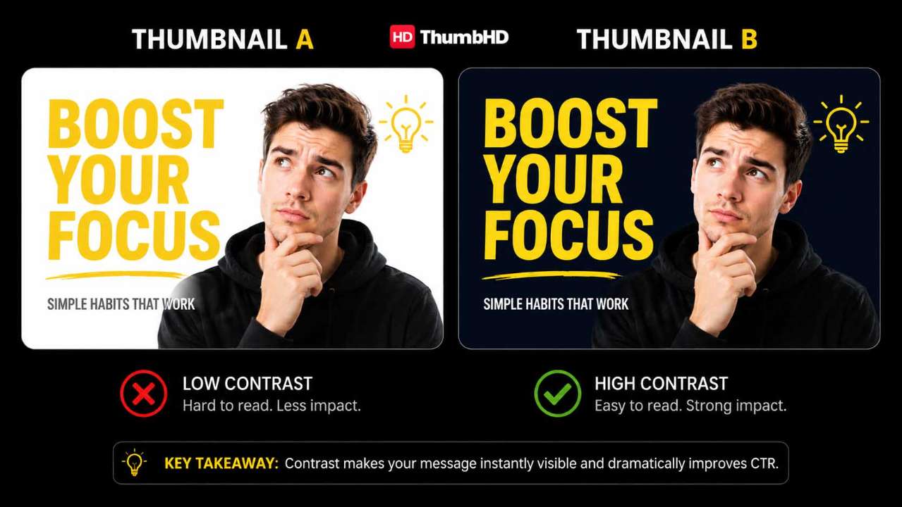
A theoretically perfect color is useless if the viewer cannot distinguish it from its surroundings.
Contrast is often more important than the psychological label attached to a color.
Consider two thumbnails.
Thumbnail A
Thumbnail B
Same yellow.
Completely different result.
Why?
Because the surrounding environment changed.
Five types of contrast you should understand
1. Light-dark contrast
Bright subject against dark background.
Example: white face + black background
2. Hue contrast
Different colors create separation.
Example: orange object + blue background
3. Saturation contrast
A highly saturated object against a muted background.
Example: bright red phone + gray room
4. Size contrast
A large focal subject surrounded by smaller supporting elements.
5. Detail contrast
A highly detailed subject against a simple background.
These work together.
The strongest thumbnail isn't necessarily the one with the most color.
It is often the one where the viewer can instantly determine:
“This is the thing I should look at.”
How to Choose YouTube Thumbnail Color Combinations
Choosing individual colors is only half the job.
The next question is:
“Which colors should I put together?”
There are several useful approaches.
Complementary Colors
These sit opposite each other on a traditional color wheel.
Examples:
- blue + orange
- purple + yellow
- green + red
They can create strong visual separation.
For example:
blue background + orange subject
can immediately separate the subject from the background.
However, don't make both colors equally intense across the entire canvas.
Use one as the dominant environment and one as the focal accent.
Analogous Colors
These sit close together.
Examples:
- blue + purple
- yellow + orange
- green + blue
They generally produce a more harmonious visual.
They can be useful when you want a consistent or polished look rather than extreme contrast.
The downside is that they may provide less separation.
Neutral + Accent
This is one of the safest systems for beginners.
Use:
For example:
- charcoal, white, red
- navy, white, yellow
- gray, white, orange
This approach makes it easier to control visual hierarchy.
Want to analyze the winning palettes used by high-performing channels in your space? Use our free YouTube Thumbnail Color Palette Extractor to extract exact hex codes, dominant colors, and hue distributions directly from any YouTube video.
The Complete YouTube Thumbnail Creation Process
Now let's turn the psychology into an actual workflow.
You do not need to begin by opening a design tool.
Start with the video.
Step 1: Define the Video's Promise
Before choosing colors, write one sentence:
“What will the viewer get from this video?”
For example:
“I tested 10 productivity apps to find which one actually saves the most time.”
That gives you a concept. Your thumbnail might focus on: a phone, 10 app icons, a shocked expression, one winning app, a comparison. The thumbnail should visually communicate the promise.

Step 2: Identify the Emotional Angle
Ask:
What should the viewer feel when they see this?
Possible directions include: curiosity, surprise, excitement, tension, achievement, fear, humor, discovery, transformation.
Now color becomes useful. For example: High-energy challenge could use a warm, saturated palette. Educational tutorial could use cleaner blues, whites and neutral tones. Mystery could use dark backgrounds with a strong accent. Transformation could use contrasting “before” and “after” colors.
Step 3: Choose One Focal Point
Every thumbnail needs a visual priority. Your focal point could be: a face, product, object, result, before/after comparison.
Ask: “If I blur the thumbnail slightly, what do I notice first?” If the answer is “Everything,” you have a hierarchy problem.
Step 4: Choose the Background
The background should support the subject. It should not compete with it. A common beginner mistake is spending too much time creating a beautiful background. The viewer doesn't necessarily care about the background. They care about the idea. If the background is stealing attention from the subject, simplify it.
Step 5: Choose the Dominant Color
Now apply the psychology.
Ask:
- What does this video promise?
- What emotion supports that promise?
- What color family could reinforce that feeling?
- Does that color separate the subject from the background?
For example:
Video: “I Tried a 30-Day Fitness Challenge”
Potential palette:
- dark background
- bright green or orange accent
- white text
- expressive face
The color isn't the strategy.
The visual story is the strategy.
Color supports it.

Step 6: Add One Strategic Accent
An accent can be: a number, arrow, circle, object, keyword, outline, glow, highlight.
Step 7: Decide Whether Text Is Necessary
Thumbnail text should not automatically repeat the title.
Title: “I Tried Waking Up at 5 AM Every Day for 30 Days” | Thumbnail: “5 AM?!”
The title provides context. The thumbnail provides a visual hook. Together they tell a stronger story.
Step 8: Make the Text Readable
Never sacrifice readability for style. Check font size, weight, background contrast, line spacing, text length, placement. Short beats clever.
Step 9: Separate the Subject From the Background
You can use brightness differences, color differences, saturation differences, outlines, shadows, background blur, negative space.
Step 10: Test It at Small Size
Zoom out. Make it small. Ask: Can I recognize the subject? Can I read the important word? Can I understand the basic idea? Is the focal point still obvious?
The 10-Second YouTube Thumbnail Test
Before publishing, run this checklist.
- What do I notice first? If you don't have a clear answer, improve the hierarchy.
- Can I understand the subject? If not, make the subject larger or simpler.
- Is there one dominant focal point? If there are five, reduce them.
- Does the background compete? If yes, simplify it.
- Can I read the text quickly? If no, increase contrast or reduce text.
- Does the color support the video's promise? If not, reconsider the palette.
- Is there enough contrast? Check subject/background and text/background.
- Does the thumbnail create curiosity? A technically beautiful thumbnail can still have a weak concept.
- Does it complement the title? The two should work together rather than repeating each other.
- Does it still work when small? This is the final test.
Common YouTube Thumbnail Color Mistakes
Mistake 1: Using Every Bright Color
More color does not automatically mean more attention. A rainbow of saturated elements can destroy hierarchy.
Better approach: Choose a dominant visual environment and use bright colors selectively.
Mistake 2: Copying the “Red Means Clicks” Formula
Red can be useful. But if every creator uses red arrows, red circles and red text, adding more red does not automatically make your thumbnail distinctive. Use red when it supports the concept.
Mistake 3: Using Low Contrast
Examples: gray text on gray background, yellow text on white, dark blue subject on black, dark green object on dark background. The viewer shouldn't have to work to understand your thumbnail.
Mistake 4: Making the Background More Interesting Than the Subject
A detailed background may look impressive in a design editor. At thumbnail size, it can become noise.
Mistake 5: Using Color Without Understanding Saturation
Two reds can communicate very different visual experiences. A muted burgundy and a neon red are not interchangeable. Color has multiple dimensions: hue, saturation, lightness.
Mistake 6: Using Color to Create Fake Urgency
If every video has red arrows, shocked faces, warning symbols, giant yellow text, the style eventually loses meaning. Use visual intensity selectively.
Mistake 7: Making the Thumbnail Misleading
A thumbnail should create curiosity without making a false promise. A click is not the final goal. A valuable click is.
YouTube Thumbnail Color Psychology Myths
Myth 1: Red Is the Best YouTube Thumbnail Color
There is no universal best color. Red may be appropriate for one video and completely wrong for another.
Myth 2: Yellow Always Gets Attention
Yellow can be highly visible when it contrasts with its surroundings. But yellow text on a pale background can be nearly invisible. Contrast matters.
Myth 3: Blue Automatically Creates Trust
Blue has certain widely observed associations, but viewer interpretation depends on context. Don't treat color as a psychological switch.
Myth 4: Three Colors Always Produce the Highest CTR
There is no universal color-count formula. A minimalist two-color thumbnail can outperform a complex five-color thumbnail.
Myth 5: Color Is More Important Than the Idea
It isn't. A fantastic palette cannot rescue a weak video concept. The viewer needs a reason to care.
Color, Accessibility and Inclusive Thumbnail Design
A strong thumbnail should not depend entirely on color to communicate meaning.
For example, imagine:
- green = correct
- red = incorrect
A viewer with color-vision deficiency may not experience the distinction in the same way.
Instead, combine color with:
- check marks
- X symbols
- arrows
- labels
- position
- shape
- text
The same principle applies to contrast.
If your thumbnail relies on tiny differences between two similar colors, simplify it.
Accessibility isn't just a technical concern.
It can make your thumbnail clearer for everyone.
Why Color Meaning Changes With Context
One of the biggest problems with online color psychology articles is that they treat colors as universal emotional dictionaries.
Human color perception is more complicated.
Consider red.
Red apple
May communicate food, freshness or temptation.
Red warning sign
May communicate danger.
Red sports jersey
May communicate competition or team identity.
Red heart
May communicate love.
Same basic color.
Different context.
That's why your thumbnail should start with the message, not the color.
A Practical Color-Selection Formula for Beginners
If you don't know what colors to use, follow this sequence:
- Start With the Video Promise: What is the viewer going to discover?
- Pick the Emotional Direction: Is the concept exciting, surprising, calm, mysterious, educational, dramatic, or playful?
- Choose the Focal Subject: Face, object, result or comparison.
- Choose a Background That Separates It: Don't pick a background because it looks pretty. Pick it because it creates hierarchy.
- Select One Dominant Color Family: This establishes the visual environment.
- Add One Supporting Color: Use it to build harmony or separation.
- Add One Accent if Necessary: Use it for the most important visual cue.
- Check Contrast: Especially text/background, face/background, object/background.
- Reduce Unnecessary Elements: Delete anything that doesn't help the idea.
- Test the Finished Thumbnail: Small size first. Then real-world performance.
Three Complete Thumbnail Examples
Example 1: Productivity Video
Video: “I Tried 10 Productivity Apps So You Don't Have To”
Thumbnail concept: A person holding a phone with several app icons.
Color strategy: dark navy background, white face/text, yellow number “10”, small orange accent.
Why it works conceptually: The dark background provides space. Yellow creates a strong focal accent. White keeps supporting information readable. Orange can add energy without becoming the dominant color.
Example 2: Personal Challenge
Video: “I Quit Social Media for 30 Days”
Thumbnail concept: A person holding a phone with social media icons crossed out.
Color strategy: dark background, red accent, bright face, white text, one strong “30 DAYS” element.
Psychological role: The red supports the concept of restriction, conflict and intensity. The important point is not “red gets clicks.” The important point is that the palette reinforces the challenge narrative.

Example 3: Educational Tutorial
Video: “How to Build Your First Website”
Thumbnail concept: A person beside a laptop showing a website.
Color strategy: blue background, white text, bright green screen accent, neutral face/subject.
Psychological role: Blue creates a calm technical environment. Green creates a focal accent. White provides readability. The composition remains clean enough to communicate the subject quickly.
Don't Optimize Only for CTR
This is an important lesson for beginners.
It is tempting to think:
“My thumbnail's only job is to get clicks.”
But YouTube's current testing system provides an important counterexample.
YouTube's native A/B testing can compare up to three title/thumbnail combinations, and YouTube determines the winning combination primarily through watch time share, not simply the highest CTR.
This changes how you should think about thumbnails.
The goal is not:
Maximum curiosity at any cost.
The goal is:
Maximum relevant curiosity.
A misleading thumbnail might produce a click.
But if the viewer immediately realizes the video isn't what they expected, the click has little value.
Your thumbnail should make the viewer think:
“That looks interesting, and I understand what I'm getting.”
How to Test Your YouTube Thumbnail
If you have access to YouTube's native testing feature, use it.
YouTube allows eligible creators to test different title and/or thumbnail combinations.
Don't create three almost-identical thumbnails.
Test meaningful differences.
For example:
Version A
Blue background + calm expression.
Version B
Dark background + bright yellow accent.
Version C
White background + large red focal element.
Now you're testing different visual strategies.
You can learn:
“My audience responds better when the focal object has strong light-dark contrast.”
That is much more valuable than learning: “Red is good.”
What Should You Measure?
Look at:
- impressions
- impressions CTR
- views
- watch time
- average view duration
- traffic source
- audience behavior
YouTube recommends examining CTR in context rather than treating it as an isolated number.
For example: A thumbnail might have a high CTR among existing subscribers but perform differently on Home. That doesn't automatically mean the thumbnail is bad. The audience changed. The context changed. The competition changed.
A/B Testing Is Not the Same as Guessing
Suppose you believe: “Yellow thumbnails get more clicks.”
Instead of believing it, test it.
Create:
- A: Your normal thumbnail.
- B: Same concept, stronger yellow accent.
- C: Same concept, blue/orange contrast.
Then compare the results.
Over time, your own channel becomes your most valuable source of thumbnail knowledge.
Before launching live experiments, you can also benchmark your drafts with our YouTube Thumbnail CTR Analyzer to inspect visual hierarchy, focal clarity, and predicted CTR performance across different devices.
Build a Repeatable Thumbnail Style
You don't need every thumbnail to look identical.
But you can establish recognizable patterns.
For example:
- similar typography
- consistent subject placement
- recurring accent color
- recognizable framing
- consistent visual quality
- repeatable contrast strategy
The goal is not to make every thumbnail identical.
The goal is to make your channel visually recognizable while continuing to experiment.
The P.A.C.E. Framework for YouTube Thumbnail Colors
Here's a simple framework you can remember every time you design a thumbnail.
What does the video promise? If you cannot describe the promise in one sentence, don't start designing yet.
What should viewers notice first? Choose one focal point.
Does that focal point separate from the background? Use brightness, hue, saturation and composition.
What emotional expectation should the thumbnail create? Now choose colors that support that direction.
Then add the final stage:
This is the difference between designing based on assumptions and designing based on evidence.
Final YouTube Thumbnail Checklist
Before publishing, ask yourself:
Concept
- Is the video idea interesting?
- Is the thumbnail communicating the idea?
- Does it create curiosity?
Composition
- Is there one clear focal point?
- Is the subject large enough?
- Is the background simple enough?
Color
- Does the dominant color support the video's mood?
- Is the accent color actually necessary?
- Is there enough contrast?
- Are the colors competing with one another?
Text
- Is the text short?
- Is it readable?
- Does it complement the title?
- Does it remain readable at small size?
Psychology
- Does the color support the message?
- Am I relying on a color myth?
- Does context change the meaning?
Accessibility
- Is important information communicated without color alone?
- Is the contrast strong enough?
Performance
- Can I test alternative versions?
- Am I looking at CTR in context?
- Am I considering watch time rather than clicks alone?
If you can answer these questions confidently, you are no longer choosing thumbnail colors randomly.
You are designing intentionally.
Final Thoughts: The Real Psychology of a Clickable Thumbnail
The hidden psychology of YouTube thumbnail colors isn't a secret list of colors that manipulates viewers into clicking.
It is more interesting than that.
Color helps people organize what they see.
It can make one object stand apart from another. It can reinforce the emotional character of a video. It can establish visual hierarchy. It can create contrast. It can make text readable. It can make a subject feel energetic, calm, dramatic, playful or mysterious.
But color works best when it supports a strong idea.
The most effective thumbnail process is therefore not:
“Which color gets the most clicks?”
It is:
“What is my video's promise, what should the viewer notice first, and which visual system communicates that promise most clearly?”
Start with the idea.
Choose the focal point.
Build the composition.
Use color deliberately.
Create contrast.
Keep the design simple.
Make the title and thumbnail work together.
Check the thumbnail at small size.
Then measure what actually happens.
The best thumbnail isn't necessarily the most colorful thumbnail.
It is the thumbnail that makes the right viewer understand the idea, feel curiosity, and know what to expect from the video.
Color is one part of that system.
When you learn to use it intentionally, your thumbnails stop looking like collections of bright colors and start functioning like visual stories.
Frequently Asked Questions
What is the best color for a YouTube thumbnail?
There is no universally best YouTube thumbnail color. The right choice depends on the video's subject, emotional direction, background, audience and competing thumbnails.
For beginners, focus less on finding a “magic” color and more on creating strong contrast and a clear visual hierarchy.
Do YouTube thumbnail colors affect CTR?
Color can influence how viewers perceive and notice a thumbnail, but it does not determine CTR by itself.
YouTube says CTR varies according to factors such as content, audience and traffic source, so creators should evaluate CTR in context rather than treating one number as a universal benchmark.
The strongest approach is to use color deliberately and test different thumbnail concepts when possible.
How many colors should a YouTube thumbnail use?
There is no universal scientifically proven number of colors that produces the highest CTR.
Instead, give colors different jobs:
- one dominant color
- one supporting color
- one accent color when necessary
A simple palette is often easier to control, especially for beginners. The real objective is clear hierarchy and contrast, not hitting a particular color count. To study successful color schemes in your niche, use our Color Palette Extractor, and test your overall design clarity with the CTR Analyzer.
How do I choose colors for my YouTube thumbnail?
Start with the video's promise. Decide what the viewer should notice first, choose a background that separates the subject, select a color family that supports the video's emotional direction, add a contrasting accent if needed, and test the thumbnail at small size.
A simple formula is: Video promise → focal point → background → dominant color → contrast → accent → text → mobile test → performance test
The goal is not to find a color that guarantees clicks.
The goal is to create a thumbnail that communicates the right idea quickly enough for the right viewer to become curious.
THE COMPLETE CREATOR SUITE
Stop guessing. Start testing. Use our full suite of free tools to optimize your next thumbnail before you hit publish.
Monetization Checker
Check channel monetization eligibility, subscriber stats, and estimated ad revenue.
Safe Zone
Check safe zones for desktop, tablet, and mobile to protect titles and logos.
Heatmap Tracker
See exactly where viewers look first using AI eye-tracking.
Preview Simulator
See how your thumbnail looks on Mobile, Desktop, and TV.
CTR Analyzer
Predict your Click-Through Rate before you even upload.
Shorts Analyzer
Map safe zones and test vertical covers for mobile scroll-stopping power.
Thumbnail Blur Detector
Detect motion blur and test focal sharpness with 3x3 grid Laplacian math.
Clutter Detector
Find and auto-fix filler words, passive voice, and weak phrases in scripts.
Thumbnail Compressor
Shrink massive images to fit YouTube's strict 2MB limit.
WebP Converter
Optimize and convert your thumbnails for lightning-fast loading.
Contrast Analyzer
Check if your subject pops out against the background.
Brightness Analyzer
Ensure your thumbnail isn't too dark for mobile screens.
Size Checker
Verify dimensions and ensure images meet YouTube 1280x720 specs.
A/B Tester
Compare multiple thumbnail designs side-by-side.
Title Analyzer
Check character counts so your title doesn't get cut off.
1280x720 Cropper
Instantly crop any image to the perfect 16:9 YouTube ratio.
Color Analyzer
Extract the exact hex color palettes from viral thumbnails.
Thumbnail Comparison
Compare palettes and contrast ratios between two thumbnails side-by-side.
YouTube Thumbnail Downloader
Extract original 4K, 1080p, or HD video thumbnail frames directly from source servers. Complete asset resolution checks with no login requirements.
YouTube Shorts Thumbnail Downloader
Analyze vertical safe zones and extract crisp 9:16 vertical images. Integrated auto-crop engines instantly slice away empty side pillarbox bars.
Keep Reading

How to Add Timestamps to YouTube Videos (4 Beginner-Friendly Methods)
Learn how to add timestamps and video chapters to your YouTube videos — manually, automatically, with AI, and as shareable links — with real examples.
How to Increase Your YouTube CTR: The Ultimate Guide
Stop guessing what makes people click. Here are the 5 visual triggers that instantly boost click-through rates.